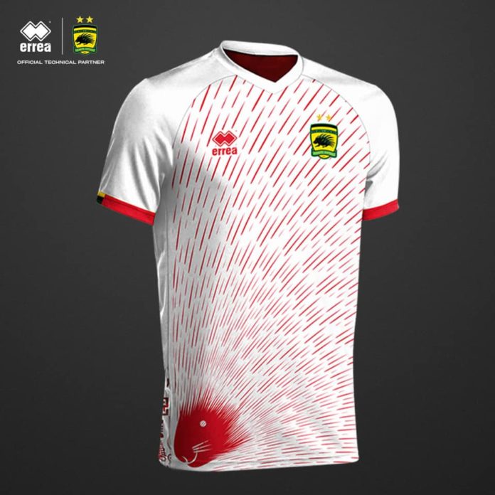
Days after cutting ties with Strike, its kit sponsor since late 2018, Ghanaian club Asante Kotoko has announced Italian supplier Errea as new partners. Promptly, four designs were posted on Kotoko’s social media pages, from which fans would get to pick their favorites via a soon-to-be-dropped short-code.
Dailymailgh.com assesses the kits and assigns to each a grade of A-D.
1. GRADE: A
Rich with the Adinkra symbolism that is so central to Akan culture, this is a shirt that connects with Kotoko’s traditional roots. It features Adinkrahene, king of the Adinkra, and whose association with authority and leadership reflects Kotoko’s status as Ghana’s premier club. Then there is Aban, meaning ‘castle’ or — quite aptly, as this is the jersey Kotoko could wear for matches at their Baba Yara Stadium home — ‘fortress’. Finally, Nsaa: a woven cloth of ultimate excellence, genuineness, and authenticity — quite befitting, given the statement Kotoko seeks to make with their new kit deal. Those symbols — on the shirt’s red canvas, with white cuffs and collar to match — make for a meaningful, aesthetically pleasant design.
2. GRADE: B
The porcupine, from which Kotoko derives its fear-inspiring nickname, adorns this white shirt with red-colored quills — those pointed, powerful, potentially fatal spikes that lend this otherwise harmless creature its famed formidableness and fear factor — in striking fashion. On the cuffs, you find some more red, as well as the yellow, black, and green — Kotoko’s official colours — of the Asante nation that the club represents. At the back of the shirt, on the lower third, is a collection of Adinkra symbols — random, perhaps, but nice.
3. GRADE: C
Kotoko’s 85-year history has been illuminated by famous figures and memorable moments, but on these shirts — made to mark the club’s latest anniversary which was celebrated not quite two months ago — those memories would be truly immortalized.
So, yes, I do like the overall concept, but… the design itself?
Erm, not so much. Somehow, I find the collection of images crowded — a bit too contrived, perhaps — but, maybe, it might grow on me when if the shirt materializes. Behind, it features the same Adinkra pattern on the shirt discussed in the preceding slide, yet the contrast isn’t as great.
4. GRADE: D
Okay, so I’m not too sure about this one. To these eyes of mine — yours, too, I guess? — it’s little more than a bunch of grey hexagons mixed with streaks of red. The caption accompanying the design claims it is “inspired by our new era of sports science and technology” and is “an artistic rendition of structures and systems working together to produce a homogeneous effect.”
Well, perhaps, but I still don’t fancy it.
But hey, my opinion needn’t be yours; when the polls are open, go #ChooseYourDesign.
NY Frimpong — Daily Mail GH


